Introduction
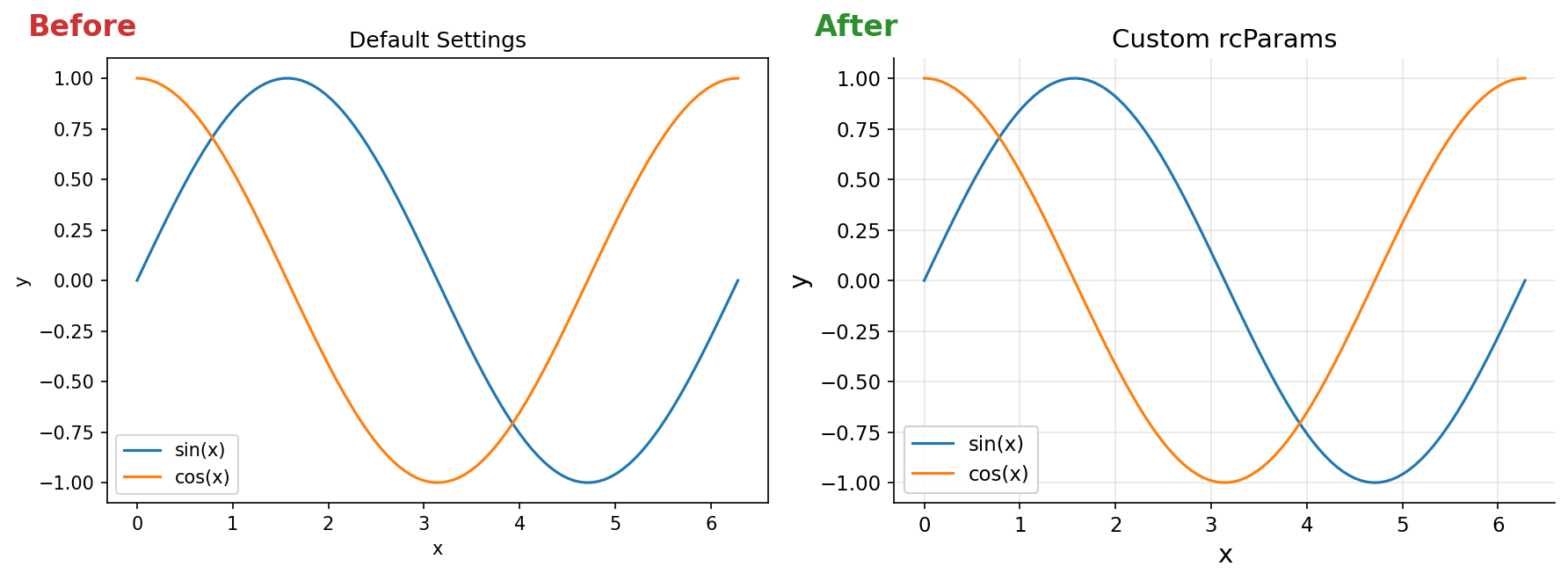
Matplotlib’s default settings produce figures that are often unsuitable for publications or presentations. Font sizes are too small, lines are too thin, and the overall appearance lacks polish. With a few configuration changes, you can produce figures that are ready for direct inclusion in papers.
This article covers practical tips for creating publication-quality figures with Matplotlib.
Global Configuration with rcParams
plt.rcParams lets you set default styles for your entire script, eliminating the need to configure each figure individually. Here is a template you can copy into your projects.
import matplotlib.pyplot as plt

plt.rcParams.update({
    'font.size': 12,
    'axes.labelsize': 14,
    'axes.titlesize': 14,
    'xtick.labelsize': 11,
    'ytick.labelsize': 11,
    'legend.fontsize': 11,
    'figure.figsize': (6, 4),
    'figure.dpi': 150,
    'lines.linewidth': 1.5,
    'axes.linewidth': 0.8,
    'axes.grid': True,
    'grid.alpha': 0.3,
})
Parameter Breakdown
font.size: Base font size. Other size parameters scale relative to this value.axes.labelsize,axes.titlesize: Axis label and title size. Setting these slightly larger than the base size improves readability.figure.figsize: Default figure dimensions in inches. Adjust to match your journal’s column width.figure.dpi: Resolution. 150 or higher ensures crisp display in notebooks.axes.grid,grid.alpha: A subtle grid helps readers extract data values from the plot.
Combining with Style Sheets
Matplotlib includes preset style sheets. When combining them with rcParams, apply the style sheet first, then override individual settings.
plt.style.use('seaborn-v0_8-whitegrid')
plt.rcParams.update({
    'font.size': 12,
    'axes.labelsize': 14,
})
Font Configuration
macOS
On macOS, system fonts like Hiragino Sans are available. You can register them manually for non-ASCII text support.
import matplotlib
from matplotlib import font_manager

font_path = '/System/Library/Fonts/Helvetica.ttc'
font_manager.fontManager.addfont(font_path)
matplotlib.rc('font', family='Helvetica')
For Japanese text on macOS, the japanize-matplotlib package is the simplest solution.
pip install japanize-matplotlib
import japanize_matplotlib
Linux
On Linux, install your preferred fonts and configure the path.
# List available fonts
fc-list

# Install Noto Sans (Ubuntu/Debian)
sudo apt install fonts-noto-cjk
Then register the font in Matplotlib.
import matplotlib
from matplotlib import font_manager

font_path = '/usr/share/fonts/opentype/noto/NotoSansCJK-Regular.ttc'
font_manager.fontManager.addfont(font_path)
matplotlib.rc('font', family='Noto Sans CJK JP')
If fonts are not recognized after installation, clear the font cache.
matplotlib.font_manager._load_fontmanager(try_read_cache=False)
Colormap Selection
Why Avoid jet and rainbow
The jet and rainbow colormaps are problematic for two reasons. First, they are not perceptually uniform – brightness varies inconsistently, which can misrepresent data magnitude. Second, they are difficult to interpret for readers with color vision deficiencies.
Recommended Colormaps
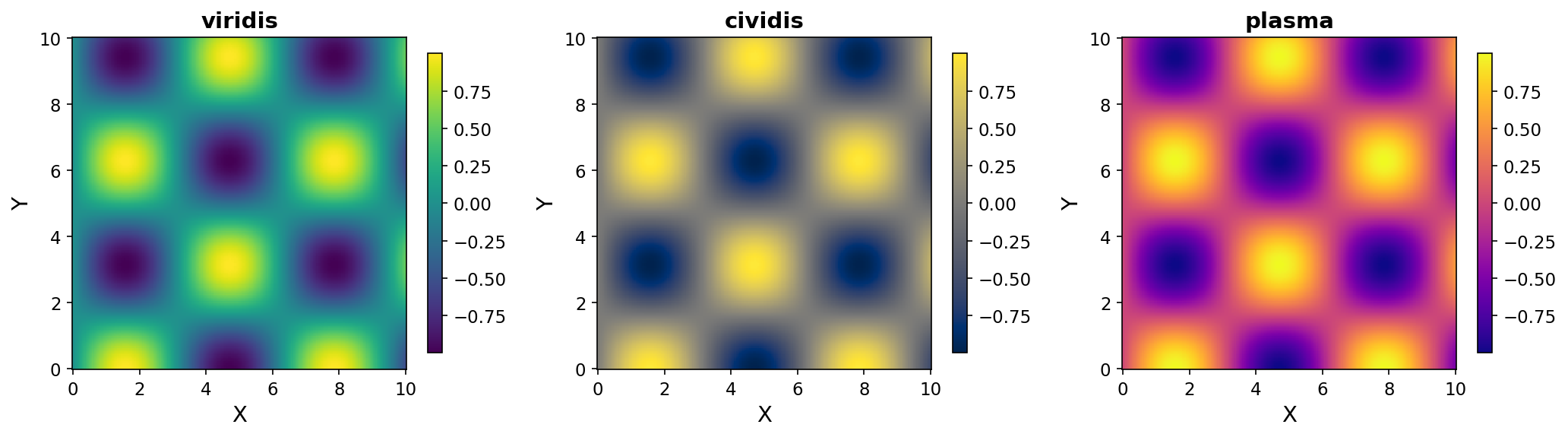
For continuous data, use one of these perceptually uniform colormaps.
- viridis: The default colormap. Perceptually uniform and accessible.
- cividis: Similar to viridis but specifically optimized for color vision deficiency accessibility.
- plasma: A warm-toned alternative. Useful for distinguishing from viridis when presenting multiple heatmaps.
import numpy as np
import matplotlib.pyplot as plt

x = np.linspace(0, 10, 100)
y = np.linspace(0, 10, 100)
X, Y = np.meshgrid(x, y)
Z = np.sin(X) * np.cos(Y)

fig, axes = plt.subplots(1, 3, figsize=(15, 4))
cmaps = ['viridis', 'cividis', 'plasma']

for ax, cmap in zip(axes, cmaps):
    im = ax.pcolormesh(X, Y, Z, cmap=cmap)
    ax.set_title(cmap)
    fig.colorbar(im, ax=ax)

plt.tight_layout()
plt.show()
Qualitative Palettes for Categorical Data
When plotting multiple series in line charts or bar charts, use qualitative palettes where each color is visually distinct.
import numpy as np
import matplotlib.pyplot as plt

np.random.seed(42)
x = np.linspace(0, 10, 100)

# tab10: Matplotlib's default color cycle (up to 10 distinct colors)
colors = plt.cm.tab10.colors

for i in range(5):
    plt.plot(x, np.sin(x + i), color=colors[i], label=f'Series {i+1}')

plt.legend()
plt.show()
Set2 and Dark2 are also good choices for publications due to their muted, professional tones.
Don’t judge “distinct enough” by eye
The advice above is common across most Matplotlib tutorials, but when you actually check tab10, Set2, and Dark2 from a color vision deficiency (CVD) standpoint, all three contain at least one adjacent pair that is hard to tell apart. Running a CVD simulation based on the physiologically-based model from Machado, Oliveira & Fernandes (2009) and computing the color difference (ΔE — higher means more distinguishable; the commonly cited target is ΔE ≥ 12) gives:
| Palette | Closest color pair | ΔE under protanopia | Verdict |
|---|---|---|---|
tab10 (default) | orange #ff7f0e ↔ green #2ca02c | 4.6 | effectively the same color |
Set2 | pink #e78ac3 ↔ blue-violet #8da0cb | 2.5 | effectively the same color |
Dark2 | olive #e6ab02 ↔ green #66a61e | 9.5 | borderline (needs a secondary visual cue) |
petroff10 (Matplotlib 3.10+) | brown #b9ac70 ↔ orange #e76300 | 29.3 | clearly distinguishable |
In other words, “Set2 and Dark2 look tasteful for publications” is reasonable aesthetic advice, but once you overlay five or more series on a line chart, readers with protanopia/deuteranopia (red-green CVD) may find specific series effectively indistinguishable. Here is what that looks like when simulated:
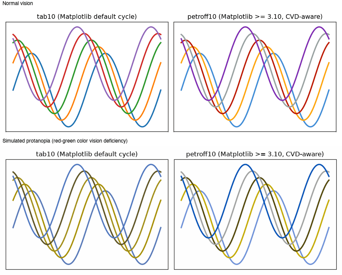
The top row is normal vision; the bottom row is simulated protanopia. In tab10 (left), the orange, green, and (partially) red lines collapse into nearly the same olive tone in the bottom row, while petroff10 (right) keeps all five series distinguishable. This simulated image was generated with the code below (the PROTANOPIA_MATRIX values were verified to match those returned by the colour-science library’s colour.blindness.matrix_cvd_Machado2009("Protanomaly", 1.0)):
import numpy as np
import matplotlib.pyplot as plt

np.random.seed(42)

# Machado, Oliveira & Fernandes (2009) protanopia simulation matrix
# (applied in linear RGB space)
PROTANOPIA_MATRIX = np.array([
    [0.152286, 1.052583, -0.204868],
    [0.114503, 0.786281, 0.099216],
    [-0.003882, -0.048116, 1.051998],
])


def simulate_protanopia(rgb):
    """Apply protanopia CVD simulation to an (H, W, 3) array of sRGB values in [0, 1]."""
    linear = np.where(rgb <= 0.04045, rgb / 12.92, ((rgb + 0.055) / 1.055) ** 2.4)
    sim_linear = np.clip(linear @ PROTANOPIA_MATRIX.T, 0, 1)
    srgb = np.where(
        sim_linear <= 0.0031308,
        sim_linear * 12.92,
        1.055 * sim_linear ** (1 / 2.4) - 0.055,
    )
    return np.clip(srgb, 0, 1)


def plot_with_cycle(ax, colors, title):
    x = np.linspace(0, 4 * np.pi, 200)
    for i, c in enumerate(colors):
        ax.plot(x, np.sin(x + i * 0.6) + i * 0.18, color=c, linewidth=2.5, label=f"Series {i+1}")
    ax.set_title(title)


tab10 = list(plt.cm.tab10.colors[:5])
with plt.style.context("petroff10"):
    petroff10 = list(plt.rcParams["axes.prop_cycle"].by_key()["color"])[:5]

fig, axes = plt.subplots(1, 2, figsize=(9, 3.4))
plot_with_cycle(axes[0], tab10, "tab10 (Matplotlib default cycle)")
plot_with_cycle(axes[1], petroff10, "petroff10 (Matplotlib >= 3.10)")
fig.tight_layout()
fig.canvas.draw()

rgba = np.asarray(fig.canvas.buffer_rgba()).astype(float) / 255
simulated = simulate_protanopia(rgba[..., :3])
plt.imsave("simulated_protanopia.png", simulated)
When CVD accessibility genuinely matters, verify with a tool rather than by eye — the same principle this article applies to colormap selection.
2024–2025 Update: CVD-Aware Palettes Are Now Built In
Matplotlib 3.10 (released December 2024) added the petroff10 style sheet (plus 6- and 8-color variants petroff6/petroff8), designed by combining CVD modeling with an aesthetics model trained on a crowdsourced color-preference survey. It’s used exactly like any other style sheet:
plt.style.use('petroff10')
Matplotlib 3.11 further adds okabe_ito, the color-vision-deficiency-friendly qualitative palette from Okabe & Ito (2008), as a built-in qualitative colormap. If you want to swap the color scheme without touching existing plotting code, switching the whole style sheet via plt.style.use() is the simplest approach. Separately, if you want to interactively inspect data point values in a notebook, mplcursors (pip install mplcursors) adds a clickable tooltip on data points.
Subplot Alignment and Shared Axes
Basic Subplots with Shared Axes
import numpy as np
import matplotlib.pyplot as plt

np.random.seed(42)
fig, axes = plt.subplots(2, 2, figsize=(10, 8), sharex=True, sharey=True)

for ax in axes.flat:
    ax.plot(np.random.randn(50).cumsum())

fig.align_ylabels(axes[:, 0])
plt.tight_layout()
plt.show()
Setting sharex=True and sharey=True unifies axis ranges across all subplots. fig.align_ylabels() ensures y-axis labels are vertically aligned. Here is what the difference actually looks like:
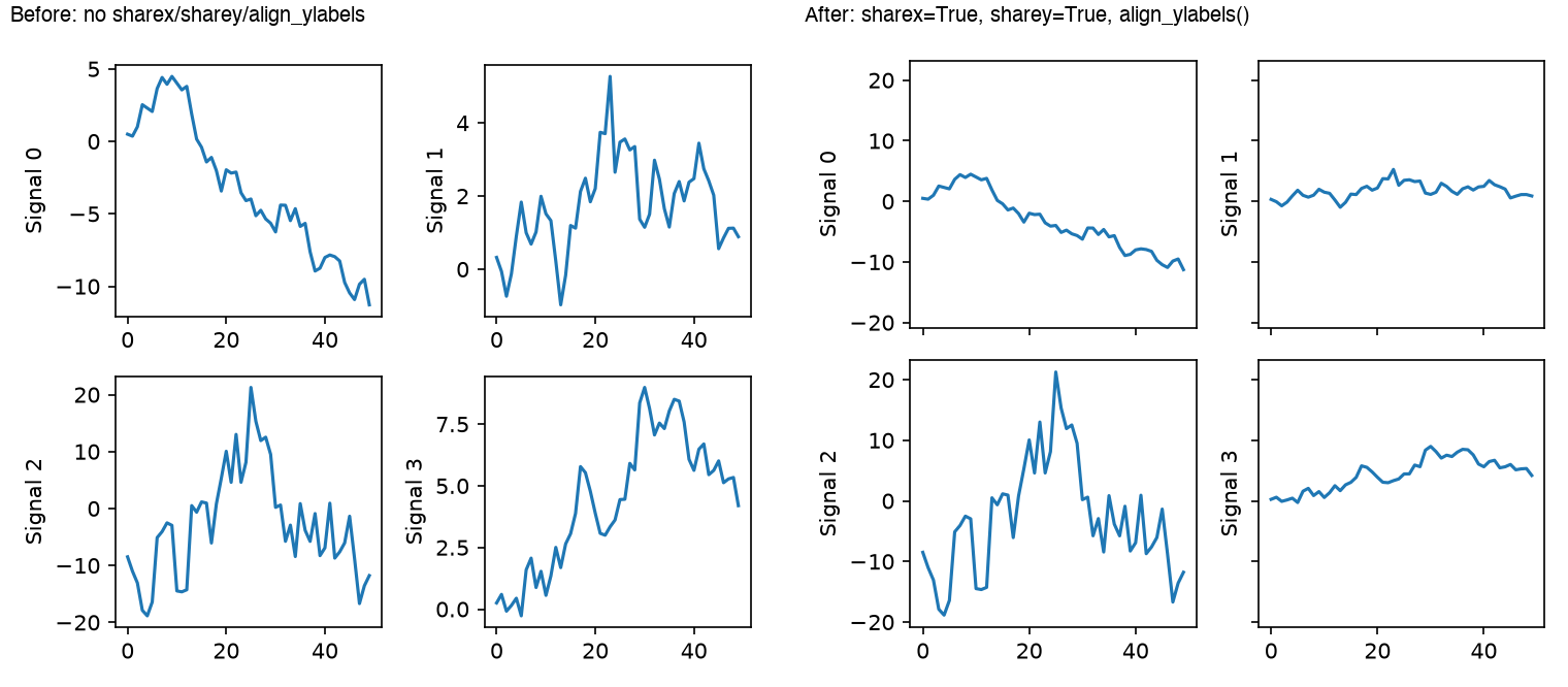
On the left (before), without sharey=True, each panel scales its own axis to its own data range independently, so the fact that Signal 2’s swing is more than 3x larger than the others is invisible from the plot. On the right (after), with sharey=True, all four panels share the same y-axis range (-20 to 20), so amplitudes become directly comparable across panels. Matplotlib also automatically hides redundant tick labels on interior subplots when sharex/sharey are set — that’s why the top row’s x-axis tick labels are omitted.
tight_layout vs. constrained_layout: How They Actually Compute Spacing
Overlapping titles and axis labels between subplots are usually fixed just by calling plt.tight_layout() (or passing a layout argument), but understanding what happens under the hood helps when it doesn’t work. First, let’s confirm the overlap actually gets fixed.
import numpy as np
import matplotlib.pyplot as plt


def build_figure(layout):
    np.random.seed(42)
    fig, axes = plt.subplots(2, 2, figsize=(5, 4.2), layout=layout)
    for i, ax in enumerate(axes.flat):
        ax.plot(np.random.randn(50).cumsum())
        ax.set_title(f"Very Long Subplot Title #{i}")
        ax.set_ylabel("Cumulative sum of\nrandom walk")
        ax.set_xlabel("Time step")
    return fig


for layout in [None, "tight", "constrained"]:
    fig = build_figure(layout)
    fig.savefig(f"layout_{layout or 'none'}.png", dpi=150)
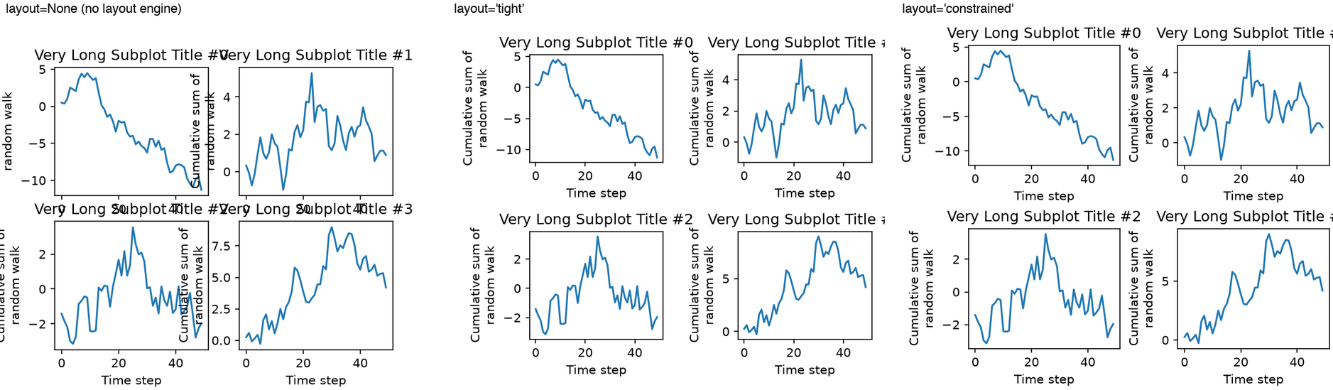
With layout=None (left), the long titles and neighboring panels’ y-axis labels overlap and become unreadable. Both layout='tight' (middle) and layout='constrained' (right) resolve this overlap. So what actually differs between the two algorithms?
tight_layout: Renders the figure once, retrieves the actual bounding boxes of each Axes’ tick labels, axis labels, and title from the renderer, and retroactively recomputessubplotpars(left/right/top/bottom/wspace/hspace) so that they don’t overlap. Because it is based purely on each Axes’ own decorations, it does not account for elements that aren’t tied to a single Axes — a legend or colorbar spanning multiple Axes, for instance.constrained_layout: Uses a constraint solver that treats every decorative element in the figure — subplots, axis labels, titles, legends, colorbars, and thesuptitle— as an object that needs space, and solves for all of them simultaneously so nothing overlaps. Because it re-solves on every draw, the layout keeps up automatically when elements are added or changed.
The difference becomes obvious once you add a colorbar shared across multiple Axes.
import numpy as np
import matplotlib.pyplot as plt

np.random.seed(42)
x = np.linspace(-3, 3, 60)
X, Y = np.meshgrid(x, x)
Z = np.sin(X) * np.cos(Y)

for layout in ["tight", "constrained"]:
    fig, axes = plt.subplots(2, 2, figsize=(6, 5), layout=layout)
    for i, ax in enumerate(axes.flat):
        im = ax.pcolormesh(X, Y, Z + 0.1 * i, cmap="viridis")
        ax.set_title(f"Panel {i}")
    fig.colorbar(im, ax=axes, shrink=0.8, label="Value")
    fig.suptitle(f"layout='{layout}'")
    fig.savefig(f"cbar_{layout}.png", dpi=150)
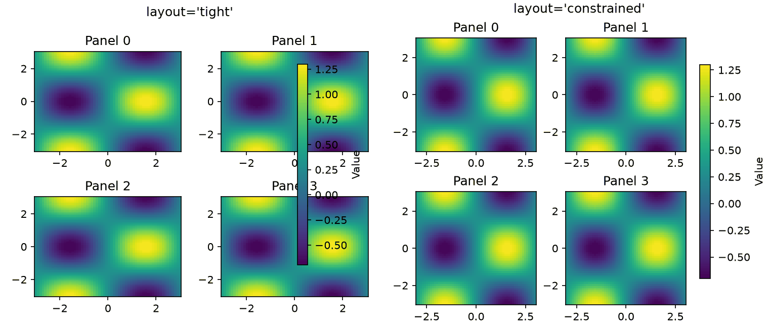
With layout='tight' (left), Matplotlib actually emits the warning “This figure includes Axes that are not compatible with tight_layout, so results might be incorrect.” at runtime, and the shared colorbar is drawn overlapping Panel 1 and Panel 3. With layout='constrained' (right), no warning is emitted and space for the colorbar is reserved correctly. tight_layout is fine if you only need to fix simple title/label overlap, but for figures containing colorbars, legends, or a suptitle, layout='constrained' (set via plt.subplots(..., layout='constrained')) is the safer choice. For grids of fixed-aspect-ratio Axes (e.g., imshow), there is also layout='compressed', which pulls the Axes closer together.
Fine-Tuning Layout with gridspec_kw
To control spacing between subplots, use gridspec_kw.
fig, axes = plt.subplots(
    2, 2,
    figsize=(10, 8),
    gridspec_kw={'hspace': 0.05, 'wspace': 0.05},
    sharex=True,
    sharey=True
)
Subplots with Different Sizes
GridSpec allows you to define subplots of varying sizes within a single figure.
import numpy as np
import matplotlib.pyplot as plt
from matplotlib.gridspec import GridSpec

np.random.seed(42)
t = np.linspace(0, 10, 200)
main_signal = np.sin(t) + 0.15 * np.random.randn(200)

fig = plt.figure(figsize=(10, 6), layout="constrained")
gs = GridSpec(2, 3, figure=fig)

ax_main = fig.add_subplot(gs[:, :2])  # Large plot spanning left 2/3
ax_main.plot(t, main_signal)
ax_main.set_title("Main signal (spans 2 rows x 2 cols)")
ax_main.set_xlabel("Time [s]")
ax_main.set_ylabel("Amplitude")

ax_top = fig.add_subplot(gs[0, 2])  # Top right
ax_top.hist(main_signal, bins=15, color="tab:blue")
ax_top.set_title("Distribution")

ax_bottom = fig.add_subplot(gs[1, 2])  # Bottom right
ax_bottom.plot(t, np.gradient(main_signal, t), color="tab:orange")
ax_bottom.set_title("Derivative")

fig.savefig("gridspec_layout_demo.png", dpi=150)
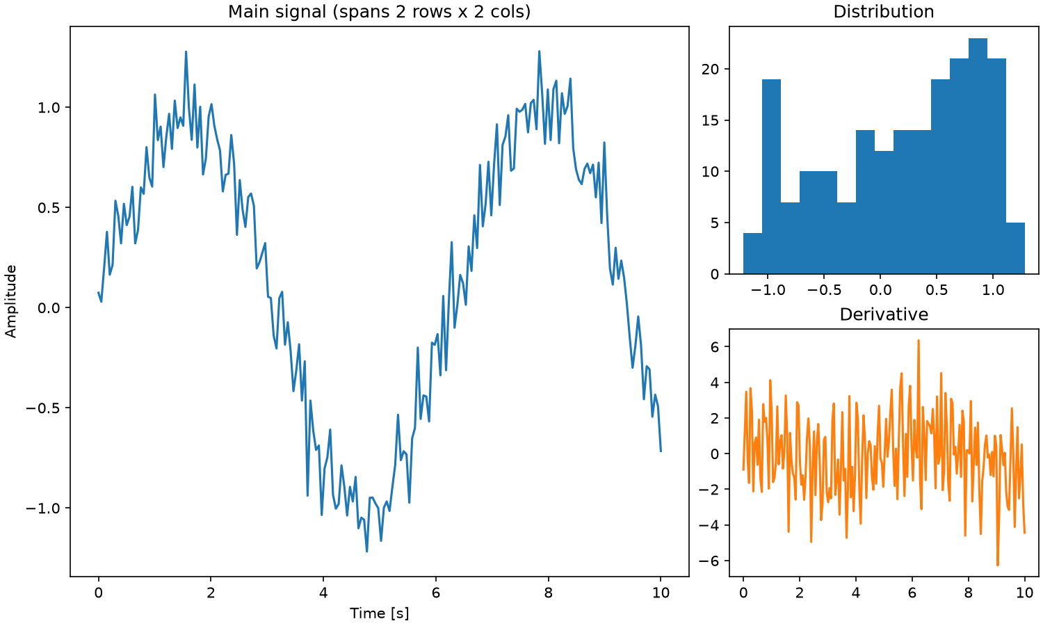
The large panel on the left spans two rows and two columns, while two smaller panels stack vertically on the right. This is a common layout for pairing a main signal with its distribution and derivative in a single figure.
Vector Output (PDF/SVG)
Saving in Vector Format
For paper submissions, vector formats (PDF, SVG) are preferred because they scale without quality loss.
fig, ax = plt.subplots()
ax.plot([1, 2, 3], [1, 4, 9])

# PDF output
fig.savefig('figure.pdf', bbox_inches='tight')

# SVG output
fig.savefig('figure.svg', bbox_inches='tight')
bbox_inches='tight' automatically trims excess whitespace around the figure.
When to Use Raster Format
Raster format (PNG) is more appropriate in certain cases:
- Scatter plots with a very large number of points (tens of thousands or more)
- Heatmaps and image plots
- When file size needs to be minimized
For raster output, specify the dpi parameter.
fig.savefig('figure.png', dpi=300, bbox_inches='tight')
Mixing Vector and Raster in One Figure
You can selectively rasterize heavy elements within a vector figure. Elements with rasterized=True are rendered as bitmaps, while the rest remains vector.
ax.scatter(x, y, rasterized=True)  # Only the scatter plot is rasterized
fig.savefig('figure.pdf', dpi=300, bbox_inches='tight')
Complete Example: Combining All Tips
Here is a full example that brings together all the tips covered in this article.
import numpy as np
import matplotlib.pyplot as plt

# Global configuration
plt.rcParams.update({
    'font.size': 12,
    'axes.labelsize': 14,
    'axes.titlesize': 14,
    'xtick.labelsize': 11,
    'ytick.labelsize': 11,
    'legend.fontsize': 11,
    'figure.figsize': (6, 4),
    'figure.dpi': 150,
    'lines.linewidth': 1.5,
    'axes.linewidth': 0.8,
    'axes.grid': True,
    'grid.alpha': 0.3,
})

# Generate sample data
np.random.seed(42)
x = np.linspace(0, 2 * np.pi, 100)
signals = {
    'Signal A': np.sin(x) + np.random.normal(0, 0.1, 100),
    'Signal B': np.cos(x) + np.random.normal(0, 0.1, 100),
    'Signal C': np.sin(2 * x) + np.random.normal(0, 0.1, 100),
}

# Qualitative palette for categorical data
colors = plt.cm.Set2.colors

# Create subplots
fig, axes = plt.subplots(1, 2, figsize=(12, 4.5))

# Left: Line chart
ax = axes[0]
for i, (label, data) in enumerate(signals.items()):
    ax.plot(x, data, color=colors[i], label=label)
ax.set_xlabel('Time [s]')
ax.set_ylabel('Amplitude')
ax.set_title('Time Series Comparison')
ax.legend()

# Right: Heatmap
ax = axes[1]
X, Y = np.meshgrid(x, x)
Z = np.sin(X) * np.cos(Y)
im = ax.pcolormesh(X, Y, Z, cmap='cividis', rasterized=True)
ax.set_xlabel('X')
ax.set_ylabel('Y')
ax.set_title('2D Heatmap')
fig.colorbar(im, ax=ax)

plt.tight_layout()

# Save in vector format
fig.savefig('publication_figure.pdf', bbox_inches='tight')
fig.savefig('publication_figure.svg', bbox_inches='tight')
plt.show()
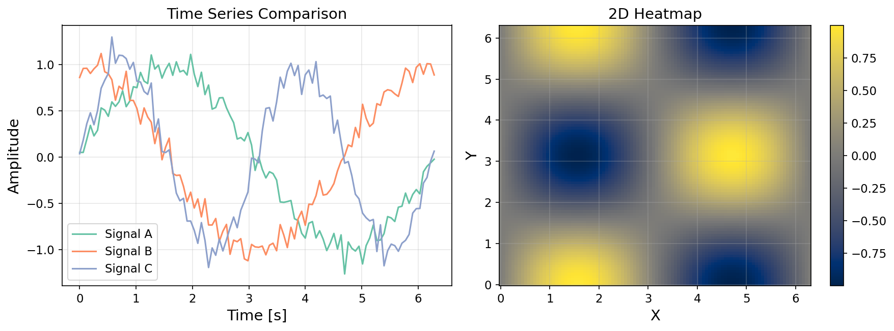
LaTeX Math Rendering and Serialization Recipes
When a figure will be embedded directly into a paper, you often want axis labels and equations rendered in the same LaTeX font as the body text. Enabling text.usetex=True tells matplotlib.pyplot to shell out to a real LaTeX installation for typesetting, so equations and symbols match your manuscript exactly.
import matplotlib.pyplot as plt
import numpy as np

plt.rcParams.update({
    'text.usetex': True,              # Use the system LaTeX engine
    'font.family': 'serif',
    'font.serif': ['Computer Modern Roman'],
    'text.latex.preamble': r'\usepackage{amsmath}\usepackage{siunitx}',
    'axes.labelsize': 12,
    'figure.figsize': (5.5, 3.5),
    'pdf.fonttype': 42,               # Embed TrueType fonts
    'ps.fonttype': 42,
    'savefig.bbox': 'tight',
    'savefig.pad_inches': 0.02,
})

t = np.linspace(0, 2 * np.pi, 200)
fig, ax = plt.subplots()
ax.plot(t, np.sin(t) * np.exp(-t / 5),
        label=r'$x(t) = \sin(t)\,e^{-t/5}$')
ax.set_xlabel(r'Time $t$ [\si{\second}]')
ax.set_ylabel(r'$x(t)$')
ax.set_title(r'Damped Oscillation: $\omega_0 = 1\,\si{\radian\per\second}$')
ax.legend(frameon=False)
fig.savefig('damped.pdf')   # PDF with LaTeX math, vector
fig.savefig('damped.svg')   # SVG
Setting pdf.fonttype=42 ensures fonts are embedded as TrueType, so the publisher’s preprocessor will not silently substitute glyphs. If you cannot install a full LaTeX distribution, leave text.usetex=False and Matplotlib’s built-in mathtext engine will still render $...$ expressions. Setting mathtext.fontset='cm' produces Computer Modern–like glyphs that visually match a LaTeX document.
savefig Recipe Table by Medium
The optimal savefig parameters depend on where the figure will end up. The table below summarizes recipes I reach for most often.
| Use case | Recommended format | Key parameters |
|---|---|---|
| Paper body (submission PDF) | figure.pdf | dpi=300, bbox_inches='tight', pad_inches=0.02, pdf.fonttype=42 |
| Editable vector (for typesetters) | figure.svg | bbox_inches='tight', transparent=False |
| Presentation slide (high-res PNG) | figure.png | dpi=300, bbox_inches='tight', facecolor='white' |
| Blog / web (lightweight PNG) | figure_web.png | dpi=150, bbox_inches='tight', facecolor='white' |
| Thumbnail | thumb.png | dpi=72, bbox_inches='tight', figsize=(3,2) |
| Print (CMYK pre-press) | figure.pdf + Ghostscript | Post-process with gs -sDEVICE=pdfwrite -dProcessColorModel=/DeviceCMYK |
Keep pad_inches small (0.02 in.) so the figure does not leave awkward whitespace inside a two-column layout. Setting facecolor='white' matters for slide decks with dark themes — otherwise the figure appears with a transparent background that displays incorrectly on dark backgrounds.
Combining with the seaborn “paper” Context
seaborn’s set_context('paper') automatically tunes font sizes and line widths for paper-sized figures. Pair it with manual rcParams overrides to keep the defaults but tweak a few specifics.
import seaborn as sns
sns.set_context('paper', font_scale=1.1)
sns.set_style('whitegrid', {'grid.alpha': 0.3})
plt.rcParams.update({'figure.dpi': 200, 'savefig.dpi': 300})
This pattern works well when you want seaborn’s tasteful defaults but need a different colorbar font size or a higher save DPI — the explicit rcParams.update wins after the seaborn call.
Common Pitfalls
Even with all the settings above in place, two pitfalls trip up nearly everyone at some point. Let’s reproduce both concretely.
savefig() After show() Can Silently Save a Blank Image
Calling plt.savefig() after plt.show() can produce a completely blank saved image. The cause lies in Matplotlib’s state management — pyplot’s global notion of the “current figure.” With an interactive GUI backend (MacOSX, TkAgg, Qt5Agg, etc.), a blocking plt.show() call destroys the Figure object from pyplot’s registry as soon as the window is closed. If you then call argument-less plt.savefig(), pyplot looks for a “current figure” to save, finds none, and plt.gcf() silently creates a brand-new empty Figure — which is what gets saved.
import matplotlib

matplotlib.use("MacOSX")  # a real interactive backend is needed to reproduce this
import numpy as np
import matplotlib.pyplot as plt

np.random.seed(42)

# WRONG: savefig() after show()
plt.plot(np.arange(20), np.random.randn(20).cumsum())
plt.title("My Figure")
plt.show()  # blocks; once the window is closed, this Figure is destroyed
plt.savefig("wrong_blank.png")  # saves a NEW, empty figure

plt.close("all")

# RIGHT: keep a reference to the Figure/Axes and save explicitly, before show()
fig, ax = plt.subplots()
ax.plot(np.arange(20), np.random.randn(20).cumsum())
ax.set_title("My Figure")
fig.savefig("right_correct.png")  # save first
plt.show()
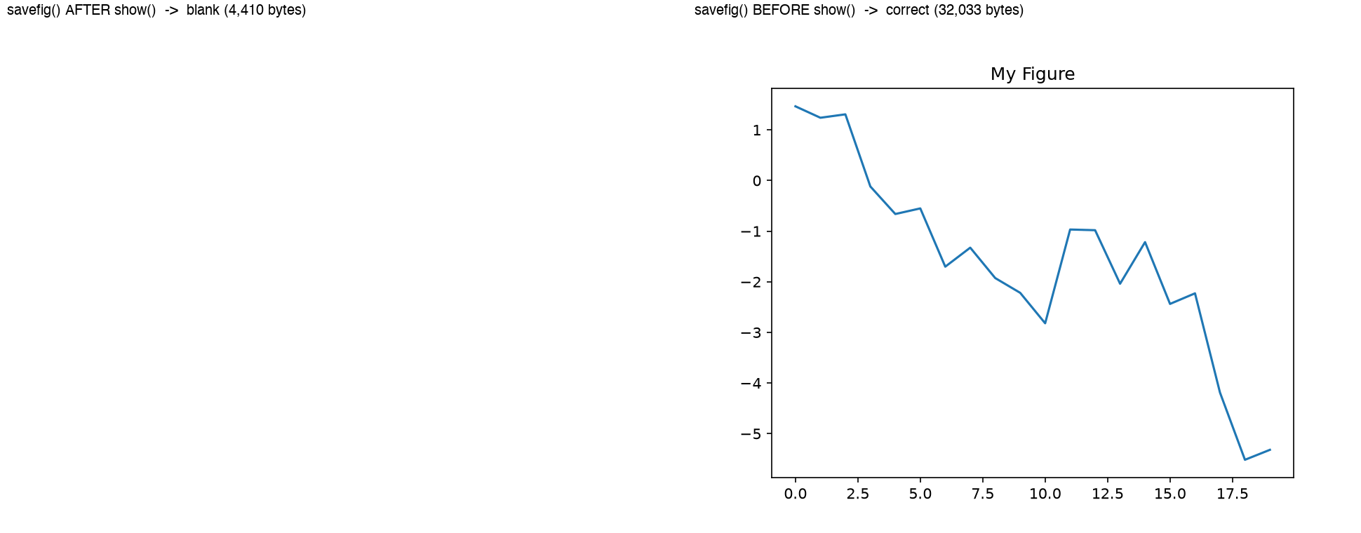
The left result is from calling savefig() after show() (a 4,410-byte blank image); the right result is from calling fig.savefig() before show() (32,033 bytes, correctly rendered). This bug does not reproduce with the non-interactive Agg backend (as used in CI environments or headless servers) because show() is effectively a no-op there. Much of the “it looked fine locally but the server produced a broken image (or vice versa)” confusion traces back to exactly this backend difference. Two reliable fixes:
- Always call
plt.savefig()(or anything relying on pyplot’s global state) beforeplt.show() - Don’t rely on pyplot’s implicit state at all — call
fig.savefig()explicitly on theFigure/Axesobjects returned byplt.subplots()(the object-oriented interface)
DPI and figsize Interaction: Looks Fine on Screen, Tiny or Huge When Saved
Matplotlib font sizes and line widths are specified in points (1 pt = 1/72 inch). The saved pixel dimensions are determined by figsize (in inches) times dpi, so if you keep figsize and font.size fixed and only change dpi, the physical size of the text (in inches) stays the same, but its size in pixels scales proportionally with dpi.
import numpy as np
import matplotlib.pyplot as plt

np.random.seed(42)

for dpi in [72, 150, 300]:
    plt.rcParams.update({'font.size': 11})
    fig, ax = plt.subplots(figsize=(4, 3), layout='constrained')  # inches, identical for all three
    x = np.linspace(0, 2 * np.pi, 100)
    ax.plot(x, np.sin(x) + 0.05 * np.random.randn(100))
    ax.set_title('Measured Signal')
    ax.set_xlabel('Time [s]')
    ax.set_ylabel('Amplitude')
    fig.savefig(f'signal_dpi{dpi}.png', dpi=dpi)
Measured results:
| dpi | Output pixel size | File size | 11pt title height (theoretical = 11pt x dpi/72) |
|---|---|---|---|
| 72 | 288 x 216 | 12 KB | 11.0 px |
| 150 | 600 x 450 | 30 KB | 22.9 px |
| 300 | 1200 x 900 | 67 KB | 45.8 px |
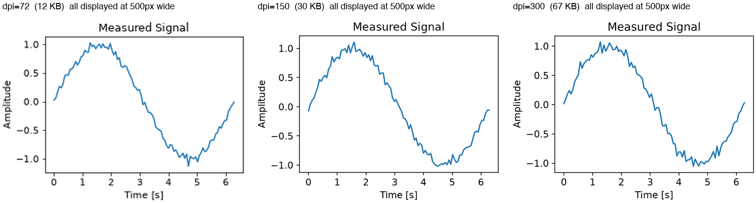
All three are displayed at the same width (500px). The dpi=72 image has fewer native pixels, so text and lines look soft/blurry once scaled up to that display width. Conversely, if you set figure.dpi high in a notebook to make a plot “look crisp” during development, but leave savefig()’s dpi argument (or the savefig.dpi rcParam) at a lower value, the saved file will look coarser than what you saw on screen. To avoid this mismatch:
- Remember that the display resolution (
figure.dpi) and the save resolution (savefig()’sdpiargument, orsavefig.dpi) are separate settings - For blog/web use, set
dpi=150-ish explicitly; for print/publication, setdpi=300or higher (see the “savefig Recipe Table by Medium” earlier in this article) - Distinguish between raising
dpiwhile keepingfigsizefixed (more absolute pixels, larger file) and changingfigsizeitself (changes the relative layout proportions) — these are different operations
Summary
Key takeaways for creating publication-quality figures:
- Define global settings with
rcParamsto maintain consistent styling across all figures - Configure fonts explicitly to ensure correct rendering on all platforms
- Choose perceptually uniform colormaps like
viridisfor accessibility. Verify categorical color choices with a CVD simulation rather than by eye —petroff10(Matplotlib 3.10+) is a pre-verified option - Use
sharex/shareyandalign_ylabelsto keep subplots aligned. For complex layouts with colorbars or legends, useconstrained_layout - Call
savefig()beforeshow(), explicitly asfig.savefig(). Manage display DPI and save DPI as separate concerns - Save final output in PDF or SVG vector format for lossless scaling
For an introduction to Matplotlib basics and creating 3D animations (GIF), see also Creating 3D Animations with Matplotlib .
Related Articles
- Fast Fourier Transform (FFT): Theory and Python Implementation - Contains spectrum graph visualization examples that pair well with the colormap recipes here.
- Continuous Wavelet Transform: Time–Frequency Analysis in Python
- Scalogram heatmaps benefit from the
cividisandrasterized=Truepatterns above. - Butterworth Filter Design with scipy.signal
- Bode plot styling that reuses the
rcParamstemplate. - Moving Average Filters Compared: SMA, WMA, and EMA in Python - Contains filter comparison graph examples.
- Building a Progress Bar in Python from Scratch - Practical Python tips.
- Python Decorators: Mechanics and Practical Patterns - Practical Python tips on decorator patterns.
- Z-Transform and Digital Filter Design
- Pole-zero maps and Bode plots benefit from the
rcParamstemplate and vector-output recipes here. - Gaussian Process Regression
- The
fill_betweenrecipes for 95% confidence bands and posterior-mean plotting reuse the styling guidance from this article.